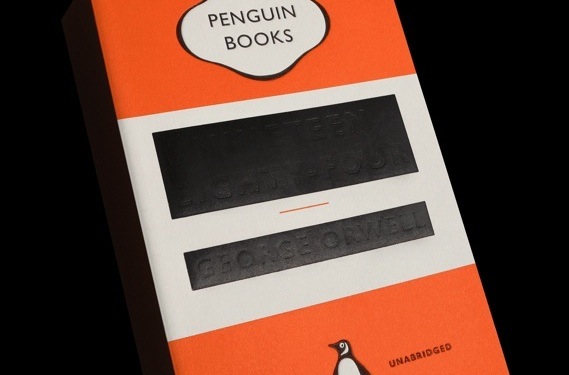
Nineteen Eighty-Four, Twenty Thirteen style
Posted: 09/01/2013 Filed under: Books, Censorship, Design | Tags: David Pearson, George Orwell, Great Orwell, Nineteen Eighty-Four, Penguin Books 1 CommentA little over a year ago, I wrote about the Art Of Penguin Science Fiction website and posted some of my favourite Penguin sci-fi book covers, including the 1962 edition of George Orwell’s Nineteen Eighty-Four (see here). I’ve always been a fan of the traditional Penguin three-stripes design, so I love the look of the spanking new edition of Nineteen Eighty-Four, for which graphics guru David Pearson has taken the original 1949 cover of the book, embossed the title and Orwell’s name, and then censored them with black blocks of ink. It’s very, well, Orwellian. It’s very striking too.
This latest edition of Nineteen Eighty-Four is part of Penguin’s “Great Orwell” series. You can read more about David Pearson’s designs for this and the other books in the series – Animal Farm, Homage To Catalonia, Down And Out In Paris And London, and Politics And The English Language – at the Creative Review blog.


Nice design. It makes me think of Bowie’s new album cover, in which an old album cover (Heroes) is covered over – only for different reasons – not as censorship.